Be yourself; Everyone else is already taken.
— Oscar Wilde.
This is the first post on my new blog. I’m just getting this new blog going, so stay tuned for more. Subscribe below to get notified when I post new updates.
Rachel Iverson – Raising Eight
Navigating Through the Visual Media World
Be yourself; Everyone else is already taken.
— Oscar Wilde.
This is the first post on my new blog. I’m just getting this new blog going, so stay tuned for more. Subscribe below to get notified when I post new updates.
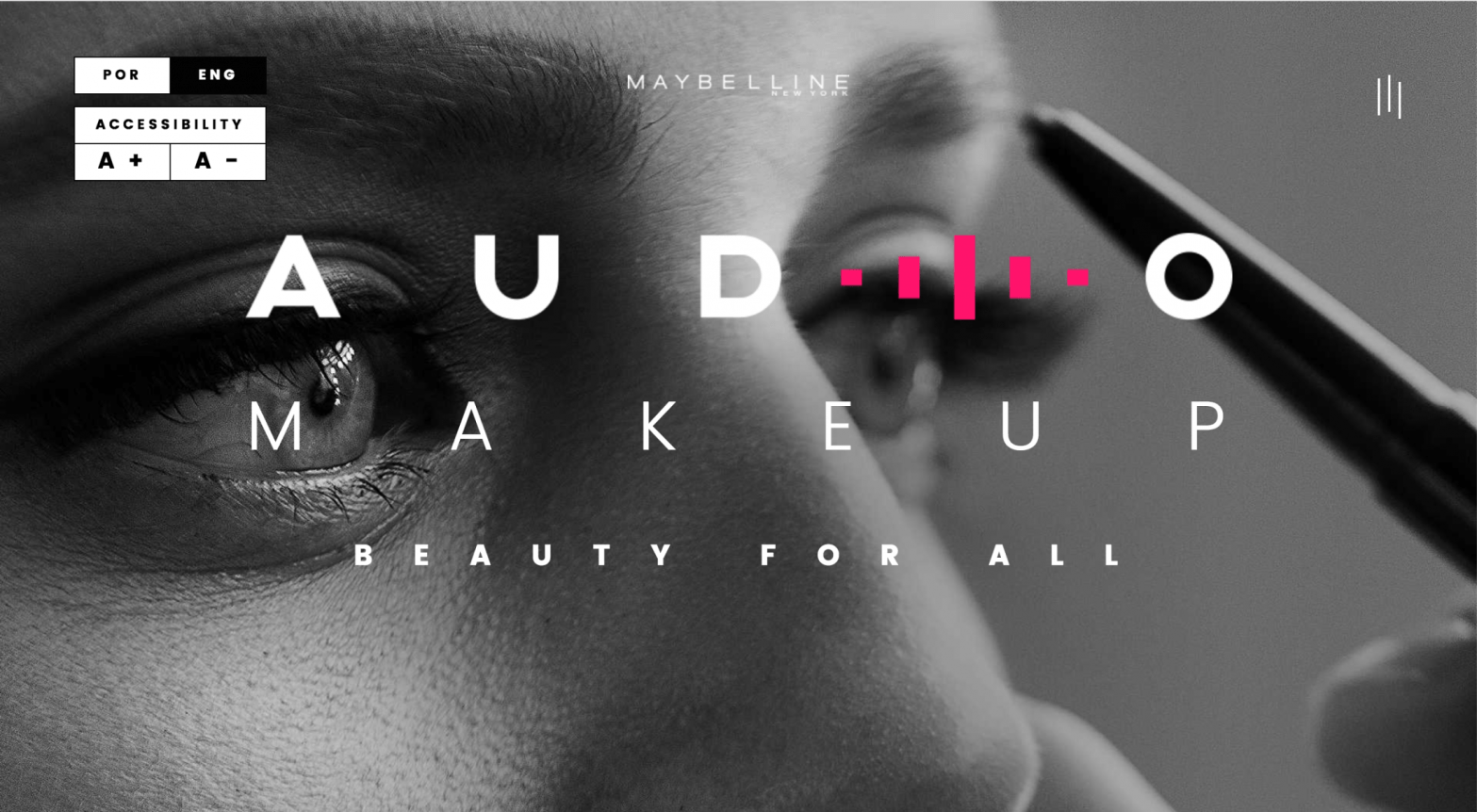
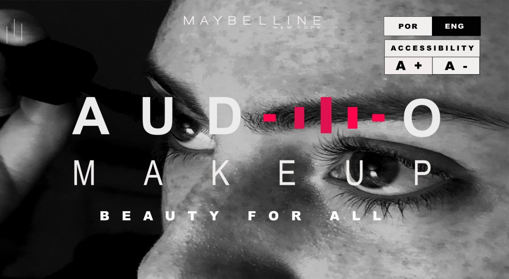
This week, the blog post is a comparison and creation of ads in the same campaign. I chose to create a secondary ad in the campaign of a new makeup line for Maybelline NY. They have created an online app that allows the visually impaired to put their own make up on through the use of sound instruction. It’s called the Audio Makeup Project. Here is the original ad that I found on “adsoftheworld.com”.

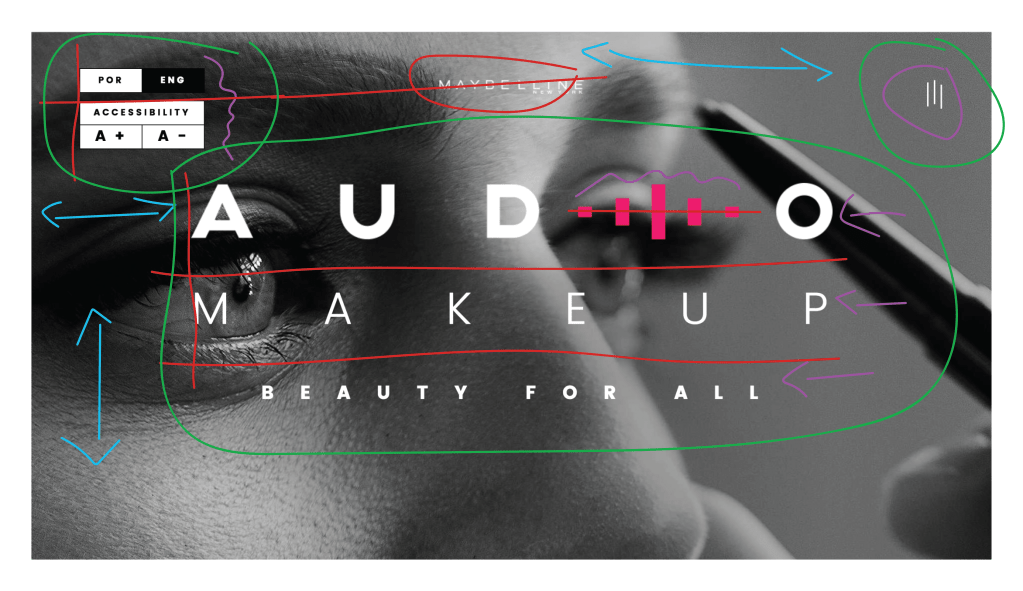
The design principle of contrast can be seen in the picture above in the color blue. We see contrast in this ad mainly by the contrast between black and white and the different shading from the light the reflects off of the eyebrow pencil, the woman’s eye and her skin. We also have contrast between the color of pink and white in the typography.
The design principle of repetition is illustrated through the color purple in the above picture. We repetition in the use of the rectangles representing the sound bars. They are the same color, but different sizes. We see repetition in the same color of font used through the entire ad except for one word.
The design principle of alignment is illustrated through the color red in the above picture. The boxes on the top left corner are aligned to the left with each other. The Maybelline logo and the campaign words are center aligned to the page.
The design principle of proximity is illustrated through the color green. The boxes to the left are all grouped together as they are similar. The sound bars in white are grouped together in the upper right corner and the campaign words are all in proximity to each other in the middle of the page.
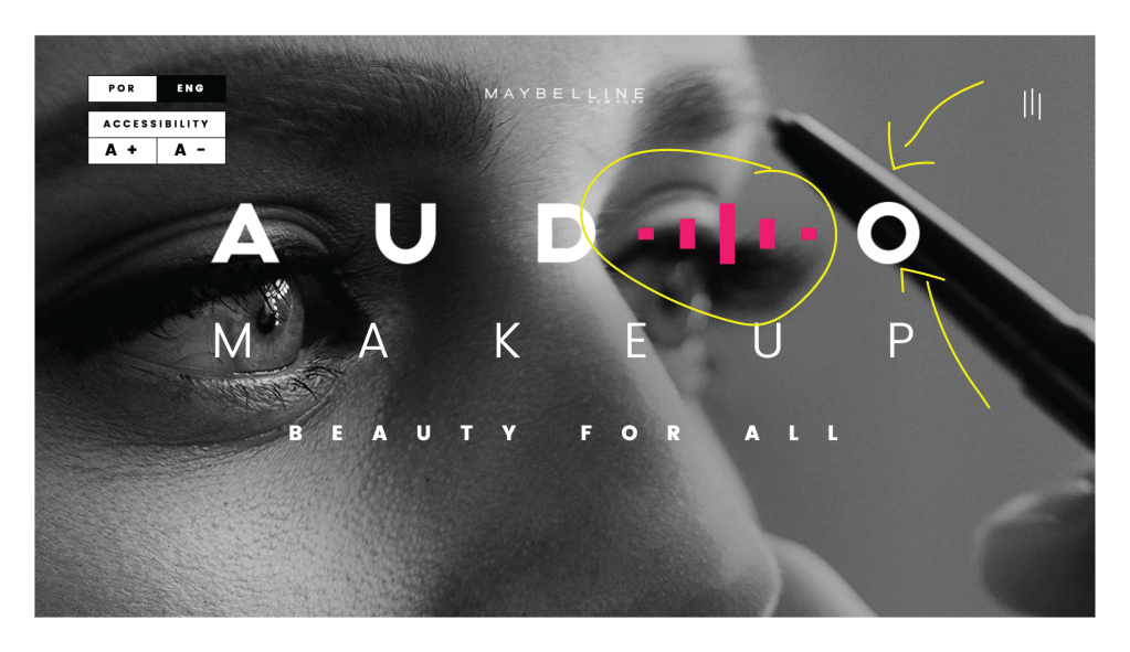
The design principle of color is illustrated in the picture above by the color yellow. There is a contrast of color with the use of the pink sound bars against the black and white picture and the black and white typography.
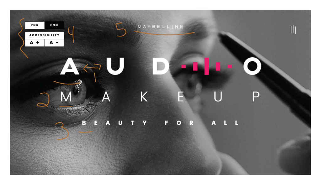
The design principle of typography is illustrated in the picture above by the color orange. Next to the #1 we see that there is special spacing used and that the typography on this line is thicker than the other areas of the campaign. This line gives really great contrast to the think line of text on line #2 and the smaller text on line #3. Section #4 has even smaller text and there is contrasting typography between the black and white text. Section #5 is the Maybelline NY logo and seems to have contrasting typography. All typography in this ad is white except for one word. All typography has varying thicknesses and sizes and all seem to be sans serifs.
This the ad that I created to be included in the campaign. It is similar in style, but slightly different. Instead of the woman using an eyebrow pencil, she is using a mascara wand. She is facing the opposite direction. The shading and lighting is slightly different. The similarities are that it’s still a woman and she is still putting some type of makeup on. The wording fonts are similar and the overall design is similar including the pink sound bars.

The design principle of contrast is illustrated in the photo above by the color blue. We see contrast in this ad just like the original ad where there is black and white, light and dark and the pink sound bars contrast against the black and white concept.
The design principle of repetition is illustrated in the photo above by the color purple where we see the same color of typography throughout, except for the black font. The font also looks similar in style, but the thickness and sizes are different. Repetition is also seen again as in the original ad with the rectangular pink sound bars and the white sound bars at the top left on this ad.
The design principle of alignment is illustrated in the photo by the color red. The first two lines of text are lined up as they were in the original ad. The rectangular boxes of text on the top right are also aligned with each other and the pink sound bars are aligned with the text they are in line with.
The design principle of proximity is illustrated in the photo by the color green. We can see that the main wording is grouped together. The boxes to the top right are grouped together because they are representing something similar and the white sound bars to the top left are grouped together.
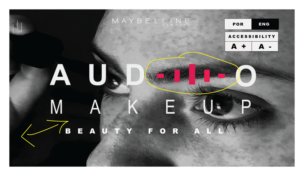
The design principle of color is illustrated in the photo above through the color yellow. We can see that there is contrast in color through the pink sound bars and the white and black lettering. There is also different shades of black, white and gray which are illuminated and reflected through light and dark shadowing.
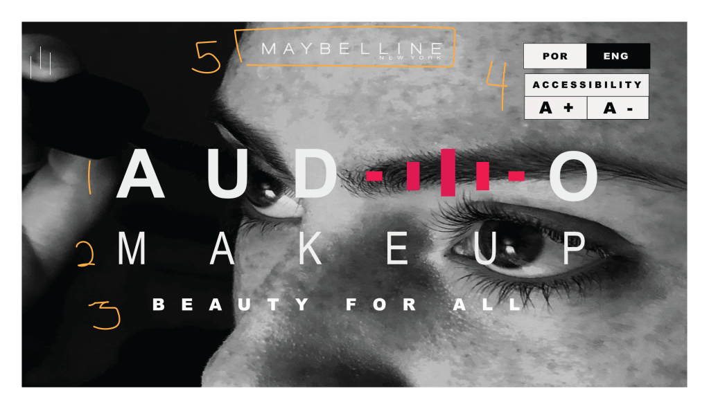
The design principle of typography is illustrated in the photo by the orange color. All typography, except for the Maybelline NY logo, are from the Ariel family. There is bold (#1), regular (#3) and narrow (#2) being used. The fonts in #4 are also in the Ariel family. They are all sans serifs. There are more spaces used between the lettering in lines 1,2, and 3 than in normal paragraph typing which adds to the contrast of the typography between each line. There is also contrast between the pink sound bars that are to represent the letter “I” and the rest of the white letters in the word “Audio”.
The reason these two ads would work well in a campaign together is because they are both clearly selling a makeup product to women by the same company. They both display the Maybelline NY logo and they have very similar ad campaign wording and structure. They also both indicate that they are promoting the Audio Makeup Project campaign.
Type & Photography Reverse Engineer Post
Visual Media
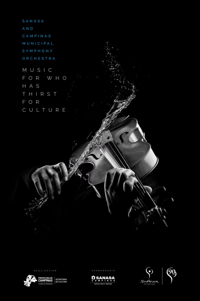
The purpose of this Reverse Engineer post is to analyze why a design is good/effective using the design elements of contrast, repetition, alignment, proximity and color in advertisements. This advertisement was used in a Brazilian ad campaign for the Sansa and Campinas Municipal Symphony Orchestra.
Credits Advertising Agency: DMC Propaganda, Campinas, Brazil Account Director: Adriana Jardini Creative Director: Thiago Taufic Account Manager: Luciana Souza Copywriter: Renato Bruno Neto Art Director: Thiago Taufic, Ignacio Carosio Digital Artist: FullFx Art Buyer: Raquel Dias Media: Talita Suter
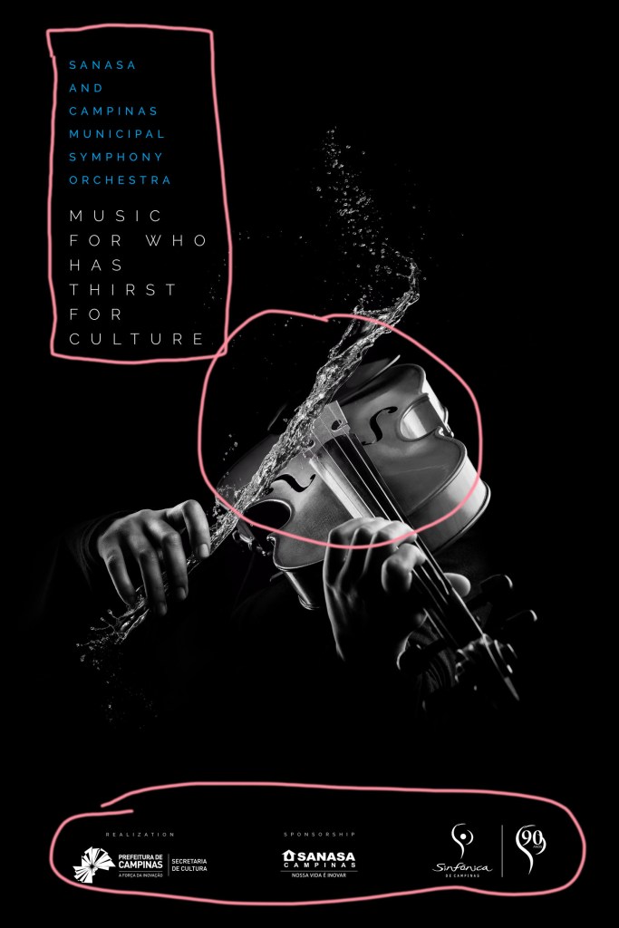
CONTRAST is shown in this ad in various places. First, there is contrast between the blue and white colored fonts. They are also different sizes. The various tints between black and white create stark, simple contrast. Finally, the contrast between the water and the violin make this a vivid and unique design.
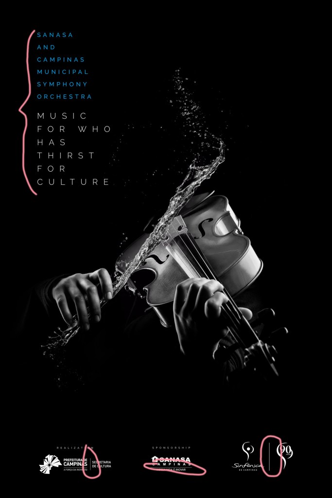
REPETITION is evidenced by the same font in the top left corner. We can also see the use of repetition with the separated information by a single white line all along the bottom of the ad.
ALIGNMENT can be seen with the ad information at the top left corner. All wording is left aligned. The information on the bottom of the page is also aligned. The picture of the violin is center aligned in a triangular pattern.

PROXIMITY is seen at the top left where the information about who is performing and what is being performed at the concert is grouped together. The information grouped together is in the same relationship. On the bottom of the page there are three groups of similar information such as realization, sponsorship and the logos.

COLOR in this ad is mostly black and white but there are various shades and hues of black and white. The designer also used blue to change the color of the font only in one section which gave just the right amount of contrast and class for this ad.

The principles of contrast, repetition, alignment, proximity and color made this an elegant, easy to read and understand advertisement. I love the contrast with the water against the violin. It is appealing, refreshing and adds an element of fun indicating that the show will be similarly entertaining. The only thing lacking here is advertisement of an actual show and any contact information.
This is an example post, originally published as part of Blogging University. Enroll in one of our ten programs, and start your blog right.
You’re going to publish a post today. Don’t worry about how your blog looks. Don’t worry if you haven’t given it a name yet, or you’re feeling overwhelmed. Just click the “New Post” button, and tell us why you’re here.
Why do this?
The post can be short or long, a personal intro to your life or a bloggy mission statement, a manifesto for the future or a simple outline of your the types of things you hope to publish.
To help you get started, here are a few questions:
You’re not locked into any of this; one of the wonderful things about blogs is how they constantly evolve as we learn, grow, and interact with one another — but it’s good to know where and why you started, and articulating your goals may just give you a few other post ideas.
Can’t think how to get started? Just write the first thing that pops into your head. Anne Lamott, author of a book on writing we love, says that you need to give yourself permission to write a “crappy first draft”. Anne makes a great point — just start writing, and worry about editing it later.
When you’re ready to publish, give your post three to five tags that describe your blog’s focus — writing, photography, fiction, parenting, food, cars, movies, sports, whatever. These tags will help others who care about your topics find you in the Reader. Make sure one of the tags is “zerotohero,” so other new bloggers can find you, too.
