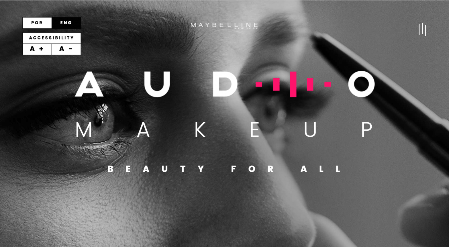
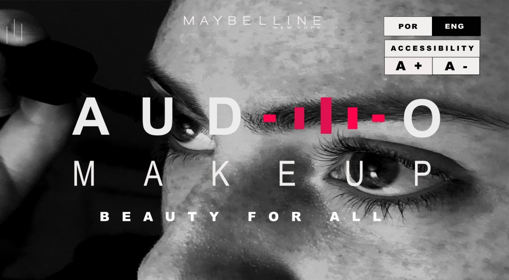
This week, the blog post is a comparison and creation of ads in the same campaign. I chose to create a secondary ad in the campaign of a new makeup line for Maybelline NY. They have created an online app that allows the visually impaired to put their own make up on through the use of sound instruction. It’s called the Audio Makeup Project. Here is the original ad that I found on “adsoftheworld.com”.
Original Ad for Audio Makeup

Maybelline Audio Makeup Ad
Agency Network: Ampfy
Published/Aired: September 2016
Posted: October 05, 2016
Credits
Advertising Agency: Ampfy, Sao Paulo, Brazil; Chief Creative Director: Fred Siqueira: Associate Creative Directors: Will Ferrari Jr, Fabiano Feijo, Vivs Araujo; Copywriter: Mateus Oliveira; Art Director: Marcelo Coelho; Assistants: Fernanda Maya, Carlos Eduardo Venciguerra, Felipe Sanches; Producer: douglas Bocalao, Vicky Salles, Arthur Raggi; Account Manager: Andre Paes de Barros, Thaissa Mirabelli, Mary Martins; Stragegic Planner: Gabriel Borges, Hugo Rodrigues, Carolina Santos; Media: Fabiana Baraldi, Leila Shimanoe, Janaina Tenorio, Carol Gattas; Digital Producer: Codezone; Sound Design: Baticum; Costumer Approval: Debora Maciqueira, Daniella Brilha, Aline Pinto, Tatiana Chain
Design Analysis
(Contrast, repetition, alignment, proximity)
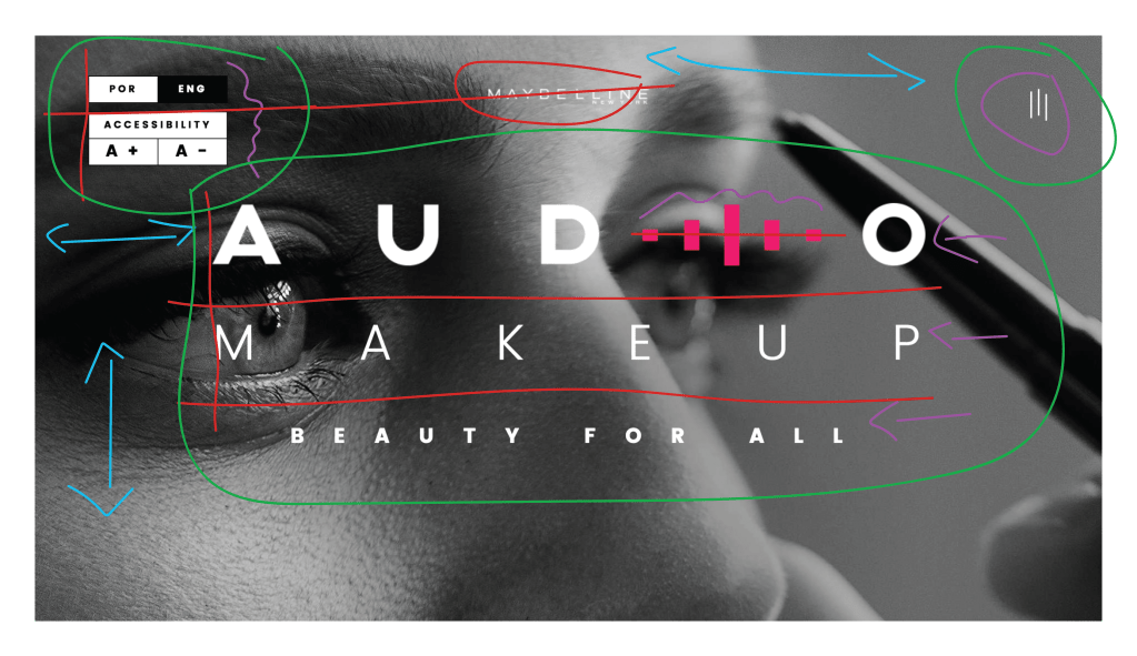
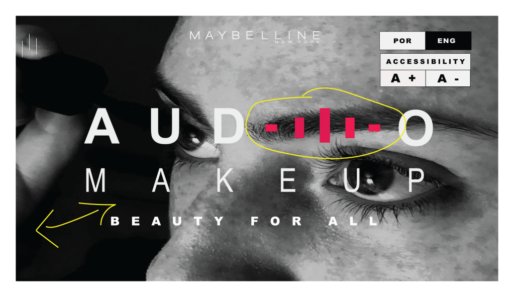
The design principle of contrast can be seen in the picture above in the color blue. We see contrast in this ad mainly by the contrast between black and white and the different shading from the light the reflects off of the eyebrow pencil, the woman’s eye and her skin. We also have contrast between the color of pink and white in the typography.
The design principle of repetition is illustrated through the color purple in the above picture. We repetition in the use of the rectangles representing the sound bars. They are the same color, but different sizes. We see repetition in the same color of font used through the entire ad except for one word.
The design principle of alignment is illustrated through the color red in the above picture. The boxes on the top left corner are aligned to the left with each other. The Maybelline logo and the campaign words are center aligned to the page.
The design principle of proximity is illustrated through the color green. The boxes to the left are all grouped together as they are similar. The sound bars in white are grouped together in the upper right corner and the campaign words are all in proximity to each other in the middle of the page.
Color Analysis
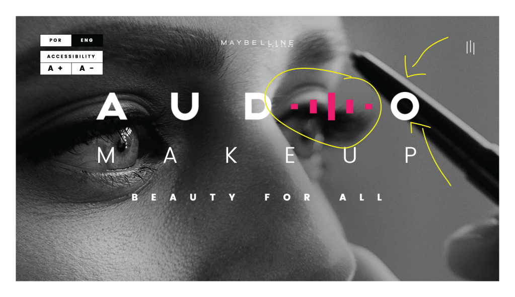
The design principle of color is illustrated in the picture above by the color yellow. There is a contrast of color with the use of the pink sound bars against the black and white picture and the black and white typography.
Typography Analysis
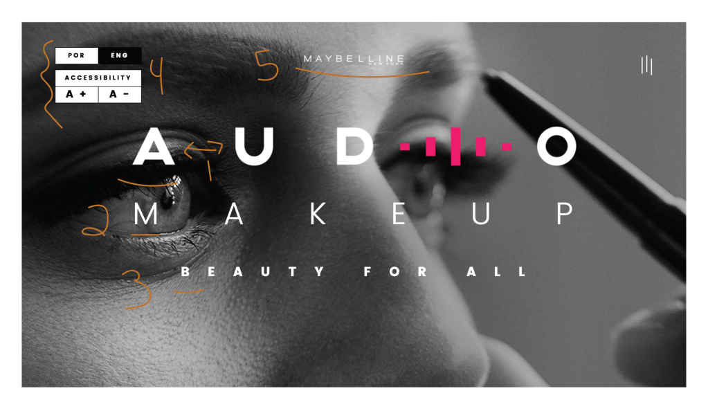
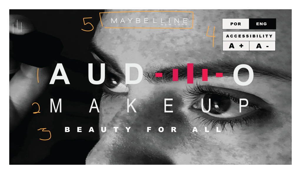
The design principle of typography is illustrated in the picture above by the color orange. Next to the #1 we see that there is special spacing used and that the typography on this line is thicker than the other areas of the campaign. This line gives really great contrast to the think line of text on line #2 and the smaller text on line #3. Section #4 has even smaller text and there is contrasting typography between the black and white text. Section #5 is the Maybelline NY logo and seems to have contrasting typography. All typography in this ad is white except for one word. All typography has varying thicknesses and sizes and all seem to be sans serifs.
My Ad Campaign Creation
This the ad that I created to be included in the campaign. It is similar in style, but slightly different. Instead of the woman using an eyebrow pencil, she is using a mascara wand. She is facing the opposite direction. The shading and lighting is slightly different. The similarities are that it’s still a woman and she is still putting some type of makeup on. The wording fonts are similar and the overall design is similar including the pink sound bars.
Design Analysis
(Contrast, repetition, alignment, proximity)

The design principle of contrast is illustrated in the photo above by the color blue. We see contrast in this ad just like the original ad where there is black and white, light and dark and the pink sound bars contrast against the black and white concept.
The design principle of repetition is illustrated in the photo above by the color purple where we see the same color of typography throughout, except for the black font. The font also looks similar in style, but the thickness and sizes are different. Repetition is also seen again as in the original ad with the rectangular pink sound bars and the white sound bars at the top left on this ad.
The design principle of alignment is illustrated in the photo by the color red. The first two lines of text are lined up as they were in the original ad. The rectangular boxes of text on the top right are also aligned with each other and the pink sound bars are aligned with the text they are in line with.
The design principle of proximity is illustrated in the photo by the color green. We can see that the main wording is grouped together. The boxes to the top right are grouped together because they are representing something similar and the white sound bars to the top left are grouped together.
Color Analysis
The design principle of color is illustrated in the photo above through the color yellow. We can see that there is contrast in color through the pink sound bars and the white and black lettering. There is also different shades of black, white and gray which are illuminated and reflected through light and dark shadowing.
Typography
The design principle of typography is illustrated in the photo by the orange color. All typography, except for the Maybelline NY logo, are from the Ariel family. There is bold (#1), regular (#3) and narrow (#2) being used. The fonts in #4 are also in the Ariel family. They are all sans serifs. There are more spaces used between the lettering in lines 1,2, and 3 than in normal paragraph typing which adds to the contrast of the typography between each line. There is also contrast between the pink sound bars that are to represent the letter “I” and the rest of the white letters in the word “Audio”.
Conclusion
The reason these two ads would work well in a campaign together is because they are both clearly selling a makeup product to women by the same company. They both display the Maybelline NY logo and they have very similar ad campaign wording and structure. They also both indicate that they are promoting the Audio Makeup Project campaign.
