Type & Photography Reverse Engineer Post
Typeface Categories
The main words “The Best of Both Worlds” appear to have typography that are both from the Sans Serif family because they don’t have any serifs anywhere, meaning no lines that stick out horizontally from the ends of the letters. They also don’t go from thick to thin lines or strokes within each letter. They have even or “monoweight” strokes. I believe that the first set of words or the thinner style of words which say “The Best of” may be Dorandi Light font or Eurostile Regular font (as indicated with the black line). The second set of words that say “Both Worlds” may be Dorandi Bold or Eurostile Bold (as indicated with the red line). They are similar in family, but they are contrasting in thickness and boldness.

The smaller text appears to be from the Modern family of typography. It is distinguishable by the thin and horizontal serifs on the lowercase letters and a vertical stress. There are also thin/thick transition strokes (see this section referenced by the green line).
Contrasting Elements
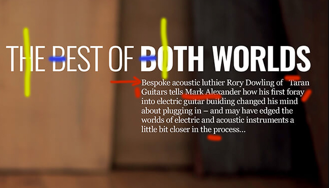
In the original picture, we can see that the words “The Best of” contrast or are clearly different in style from the words “Both Worlds”. The first set of these words is thinner than the second set of words. The smaller set of words is different than the title because the smaller words or the paragraph letters/words have serifs whereas the other words don’t. There is also a contrast in thickness and consistency of thickness between the larger words in the title and the smaller words in the paragraph. They are all the same color, so there isn’t contrast in that respect.
Rule of Thirds
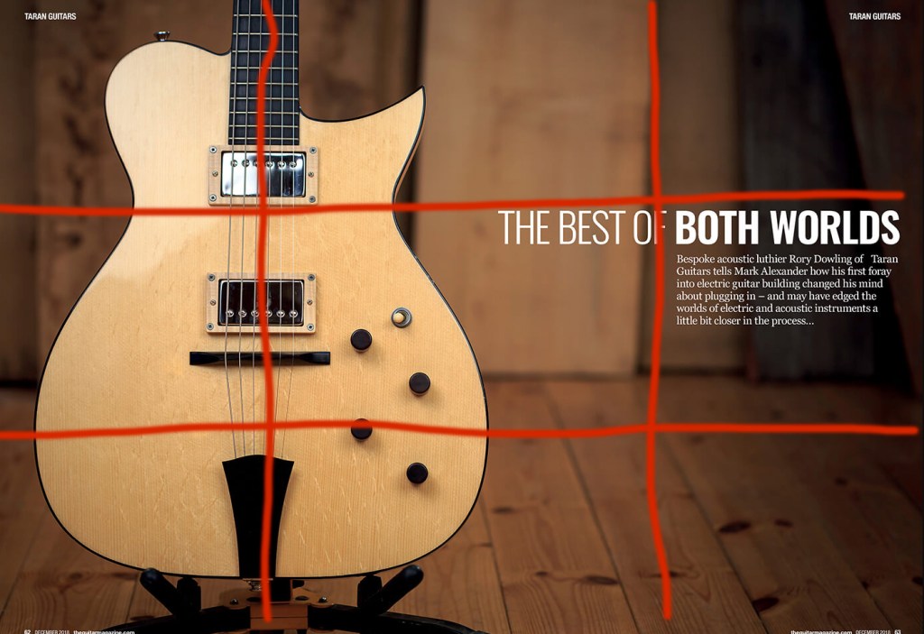
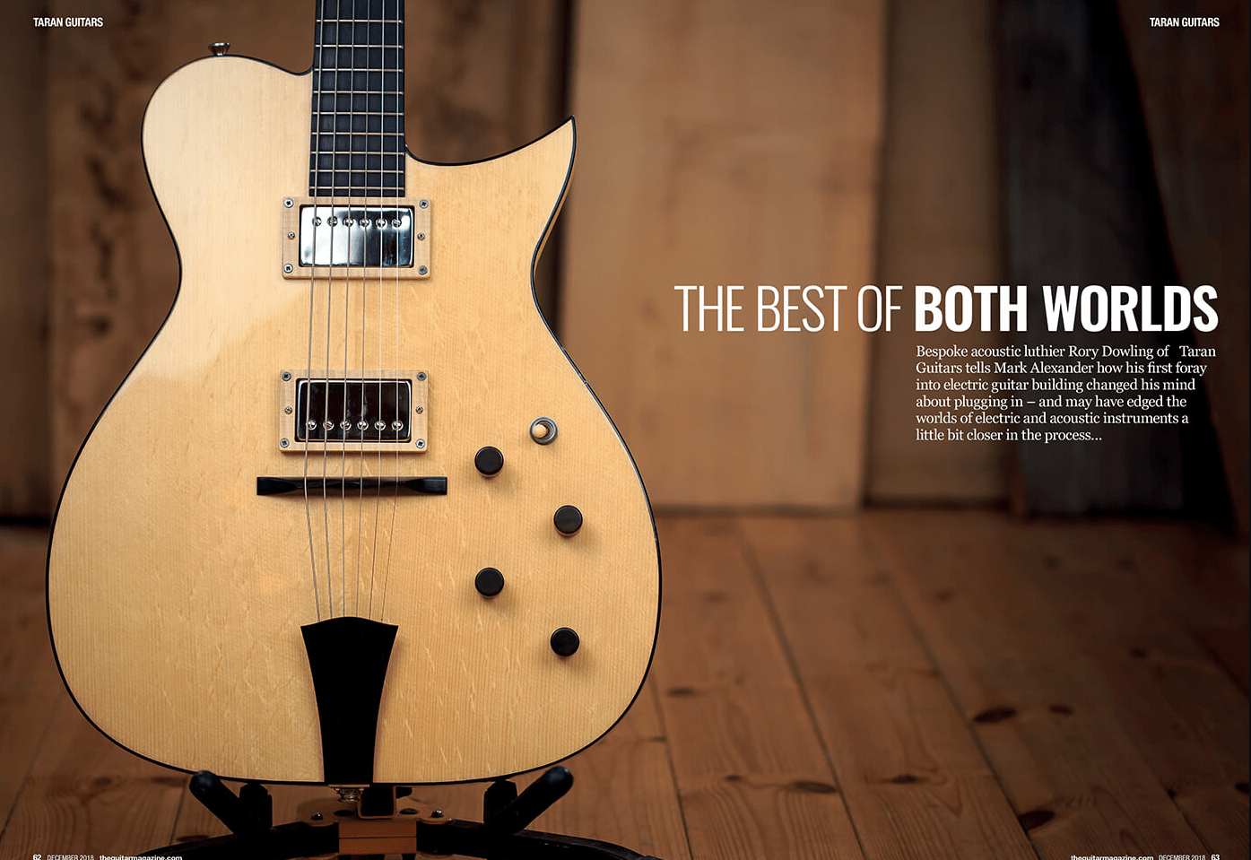
The designer and/or photographer that created this spread used the Rule of Thirds in this picture. You can clearly see that the guitar is off to the side and is right in the center of the two corner intersects where the Rule of Thirds says it should be. We can also see that they put the title and accompanying information paragraph in proximity and alignment to each other on the other side or other third of the page.
Mimicked Photos
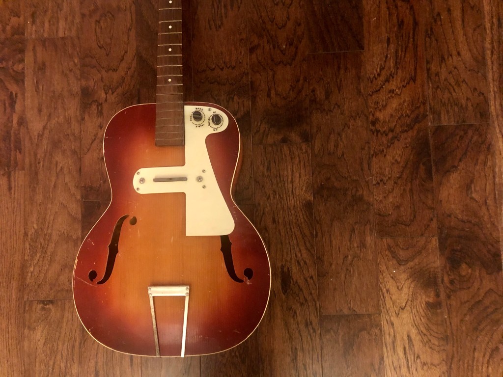

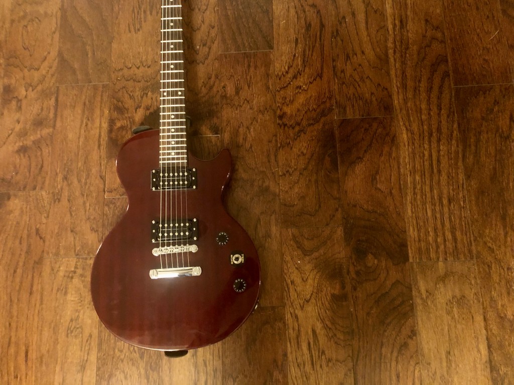
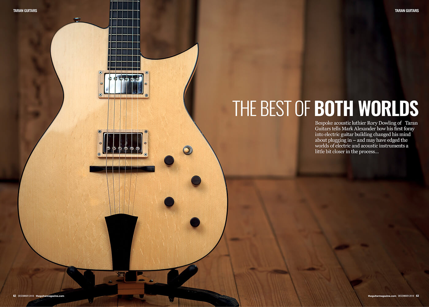
I mimicked the original photograph by selecting three types of guitars and placing them against a hardwood background similar to the background in the original picture. I attempted to create the same lighting affect as well. I also used the Rule of Thirds technique featured in the original photograph. The original picture talked about the contrasting of acoustic versus electric guitars. My photographs would work well in that same spread because I have selected a guitar that has not been luthiered yet, an acoustic guitar and an electric guitar. These depict different and contrasting types of guitar levels, sizes, colors and sounds.
Conclusion
The principles of contrasting typography in both the heading and the paragraph and the principle of Rule of Thirds used in the original photograph, create a clean and appealing advertisement. It’s pleasing to the eye. The colors of the wood in the background compliment the colors of the guitar. The white lettering stands out, but doesn’t overpower the guitar. It’s a simple design that invites the reader to enjoy the artistic features of the guitar and almost get excited about learning more. The use of proximity with the wording all grouped together, the contrast of the white against the brown and the contrast between the thick and thin letters, the repetition of the grains of wood and the same color of font and the alignment of the paragraph justified to the right under the heading all contribute to this spread being a clean and enjoyable piece of art.
