Design & Color
Visual Media
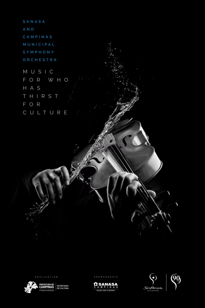
The purpose of this Reverse Engineer post is to analyze why a design is good/effective using the design elements of contrast, repetition, alignment, proximity and color in advertisements. This advertisement was used in a Brazilian ad campaign for the Sansa and Campinas Municipal Symphony Orchestra.
Credits Advertising Agency: DMC Propaganda, Campinas, Brazil Account Director: Adriana Jardini Creative Director: Thiago Taufic Account Manager: Luciana Souza Copywriter: Renato Bruno Neto Art Director: Thiago Taufic, Ignacio Carosio Digital Artist: FullFx Art Buyer: Raquel Dias Media: Talita Suter
ANALYSIS
CONTRAST is shown in this ad in various places. First, there is contrast between the blue and white colored fonts. They are also different sizes. The various tints between black and white create stark, simple contrast. Finally, the contrast between the water and the violin make this a vivid and unique design.
REPETITION is evidenced by the same font in the top left corner. We can also see the use of repetition with the separated information by a single white line all along the bottom of the ad.
ALIGNMENT can be seen with the ad information at the top left corner. All wording is left aligned. The information on the bottom of the page is also aligned. The picture of the violin is center aligned in a triangular pattern.

PROXIMITY is seen at the top left where the information about who is performing and what is being performed at the concert is grouped together. The information grouped together is in the same relationship. On the bottom of the page there are three groups of similar information such as realization, sponsorship and the logos.

COLOR in this ad is mostly black and white but there are various shades and hues of black and white. The designer also used blue to change the color of the font only in one section which gave just the right amount of contrast and class for this ad.

Conclusion
The principles of contrast, repetition, alignment, proximity and color made this an elegant, easy to read and understand advertisement. I love the contrast with the water against the violin. It is appealing, refreshing and adds an element of fun indicating that the show will be similarly entertaining. The only thing lacking here is advertisement of an actual show and any contact information.
